In this vignette, we demonstrate that the PCAviz package can be used to quickly create sophisicated plots that closely reproduce publication-quality figures; compare the plots here against the plots in Novembre et al, “Genes mirror geography within Europe,” Nature 456, 274-–274 (2008). The principal components computed from genotypes of European samples (the POPRES sample) have a remarkably close connection to the geographic distribution of the samples, which we examine in this vignette.
Begin by loading these packages into your R environment.
library(PCAviz)
library(magrittr)
library(cowplot)
# Warning: package 'cowplot' was built under R version 3.4.4
Load the data and PCA results
Load the POPRES data and PCA results, and combine these data into a “pcaviz” object. Here we also generate a sensible abbreviation for the country labels based on the ISO standard. (Note that abbreviated country labels are already available in the “abbrv” column, but we generate a new abbreviation to illustrate one of the PCAviz package features.)
data(popres)
popres <- pcaviz(dat = popres$x,
                 sdev = popres$sdev,
                 rotation = popres$rotation)
popres <- pcaviz_abbreviate_var(popres,"country")
Print a summary of the POPRES data.
summary(popres)
# principal components (PCs):
# # statistics are (s.d.,min,median,max)
# # s.d.=sqrt(eigenvalue)
#  variable n    stats
#  PC1      1387 (2.023,-0.0734,+0.0046,+0.0516)
#  PC2      1387 (1.428,-0.083,+0.0002,+0.0577)
#  PC3      1387 (1.24,-0.0968,+0.0053,+0.0685)
#  PC4      1387 (1.198,-0.0688,-0.0008,+0.177)
# categorical variables:
#  variable      n    stats
#  country       1387 33 levels, largest=Switzerland (222)
#  abbrv         1387 35 levels, largest=CH (222)
#  color         1387 31 levels, largest=violetred1 (222)
#  country.abbrv 1387 33 levels, largest=Sz (222)
# continuous variables:
# # statistics are (min,median,max)
#  variable  n    stats
#  longitude 1387 (-8.18,8.18,99.1)
#  latitude  1387 (35.1,46.8,64.6)
# other variables:
#  variable n    stats
#  id       1387 <NA>
Plot the eigenvalues of the first four PCs.
screeplot(popres,type = "eigenvalue")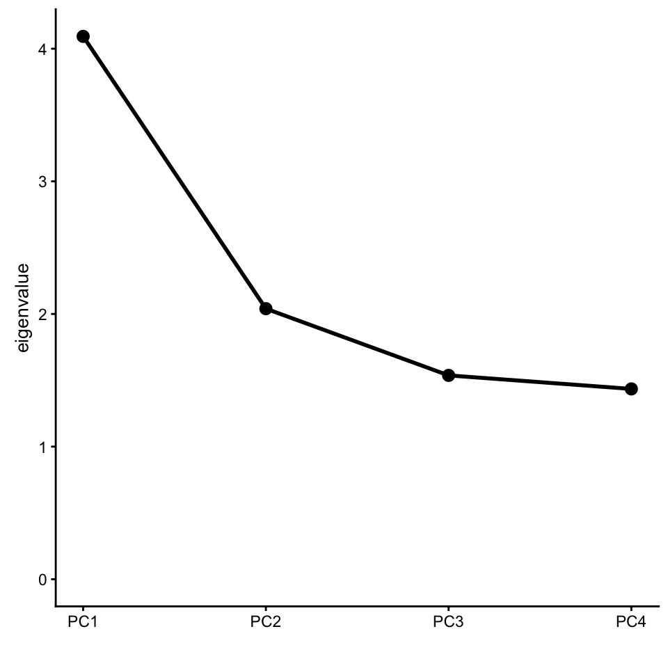
Examining the loadings for the first PC, a region on chromosome 15 clearly stands out for having an unusually large loading:
pcaviz_loadingsplot(popres,min.rank = 0.9,gap = 400)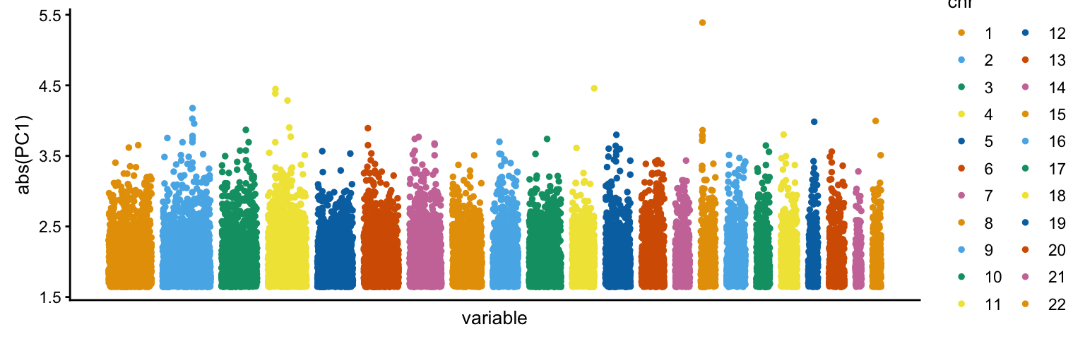
This region is the HERC2/OCA2 locus—a locus that has been shown in many studies to be involved in adaptation to local enviornments through natural selection.
Select data samples, and manipulate PCs
Remove the Russian (RU) and Scottish (Sct) samples, then rescale and rotate the PCs.
popres <- subset(popres,!(abbrv == "RU" | abbrv == "Sct")) %>%
          pcaviz_reduce_whitespace(c("PC1","PC2")) %>%
          pcaviz_rotate(105)
Retrieve the suggested coloring scheme for plotting the samples by country-of-origin.
clrs <- c(with(popres$data,tapply(as.character(color),country,
                                  function (x) x[1])))
names(clrs) <- NULL
Create visualizations of the POPRES data
Calling “plot” without specifying any additional options shows the POPRES samples projected onto the first two PCs, with the samples labeled according to their country-of-origin. This plot closely reproduces Fig. 1a of Novembre et al (2008). Note the use of the abbreviated country names.
plot(popres)
# Variance explained will be added to the axis labels.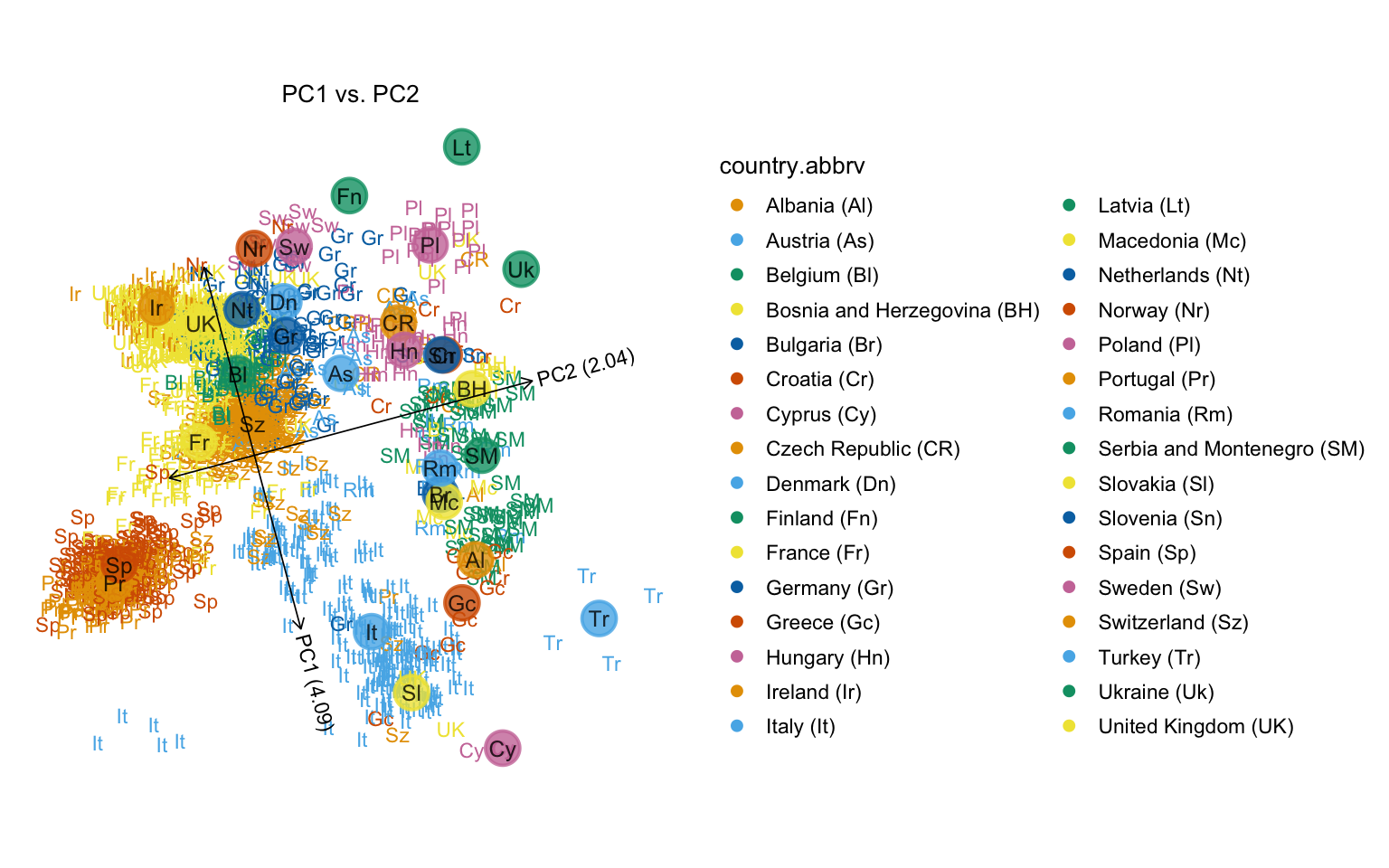
Users may supply detailed arguments to the plot function. Here except Germany and Serbia and Montenegro, only median positions in each population are plotted. Samples from Germany are set as non-transparent, while Serbia and Montenegro is semi-transparent, and the samples from the rest of the countries are fully transparent (and therefore do not appear in the plot).
v         <- rep(0,nrow(popres$data))
id_sam    <- popres$data$country == "Serbia and Montenegro"
id_ger    <- popres$data$country == "Germany"
v[id_sam] <- v[id_sam] + 0.5
v[id_ger] <- v[id_ger]  + 1
plot(popres,
     geom.text.params = list(size = 3,fontface = "plain",na.rm = TRUE,
                             alpha = v),
     geom.point.summary.params = list(shape = 16,stroke = 1,size = 10,
                                      show.legend = FALSE,alpha = 0.6),
     geom.text.summary.params = list(size = 3.25,color = "black",
                                     show.legend = FALSE,alpha = 0.8))
# Variance explained will be added to the axis labels.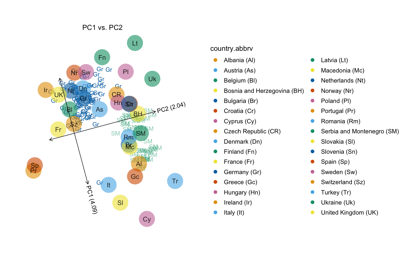
One difference with the published plot is the color scheme used. In this next code chunk, we do a better job reproducing the figure in the Nature paper by using the colors provided in the popres data table. (Note that the Russian and Scottish samples are missing from our plot since we removed them above.)
plot(popres,colors = clrs)
# Variance explained will be added to the axis labels.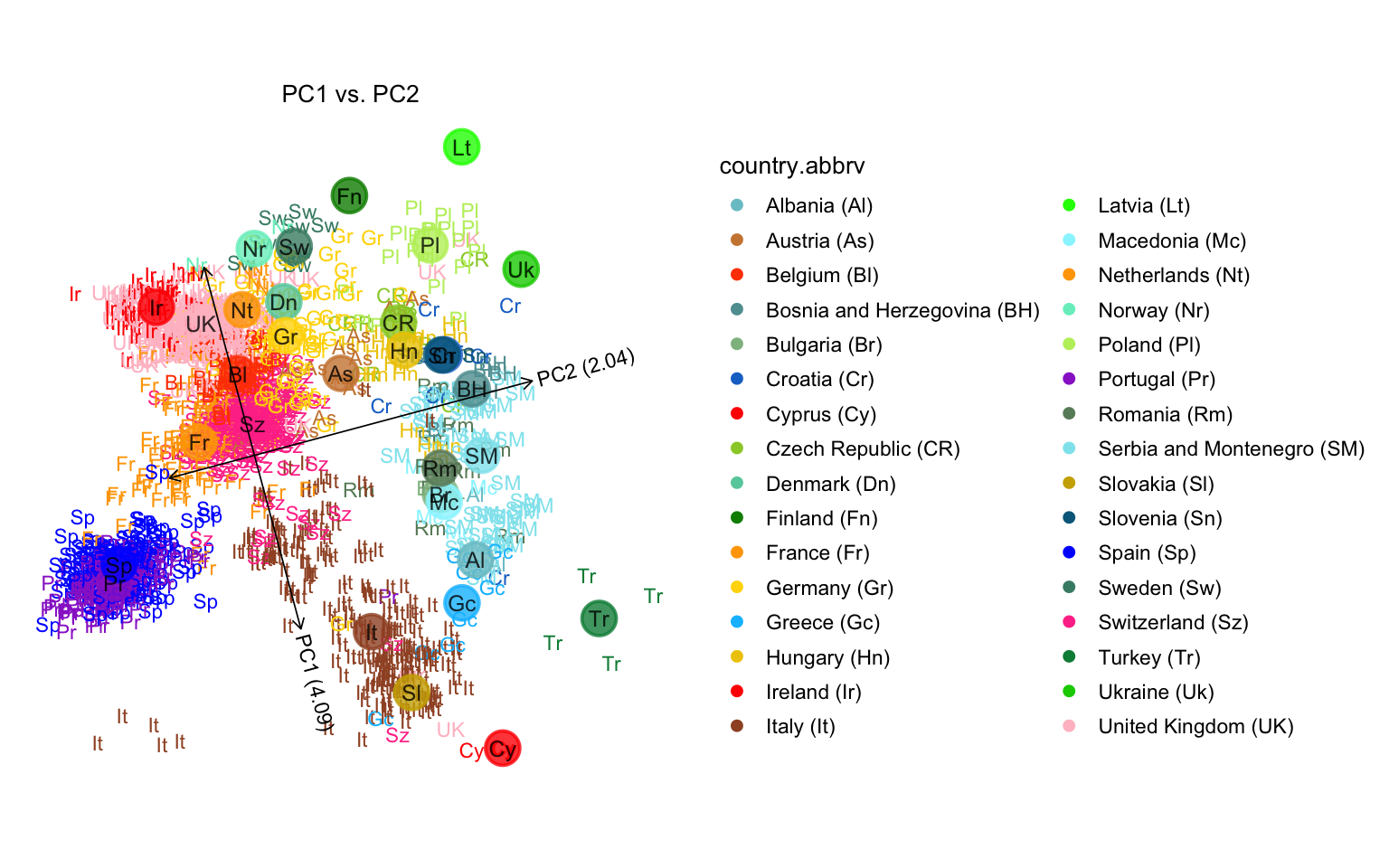
Compare this projection onto PCs 1 and 2 against the countries’ actual geographical locations:
plot(popres,coords = c("longitude","latitude"),group = "country.abbrv",
     label = NULL,colors = clrs,overlay = overlay_map_europe,
     show.legend = FALSE)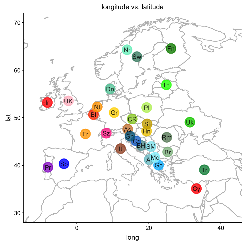
Next, we examine the relationships between PC1 and longitude, and between PC2 and latitude. When plotting a PC against a data column, the linear best fit is automatically drawn (dashed line), along with confidence intervals (dotted lines).
plot1 <- plot(popres,coords = c("latitude","PC2"),group = NULL,
              show.legend = FALSE)
plot2 <- plot(popres,coords = c("longitude","PC1"),group = NULL,
                    show.legend = FALSE)
plot_grid(plot1,plot2,labels = c("A","B"))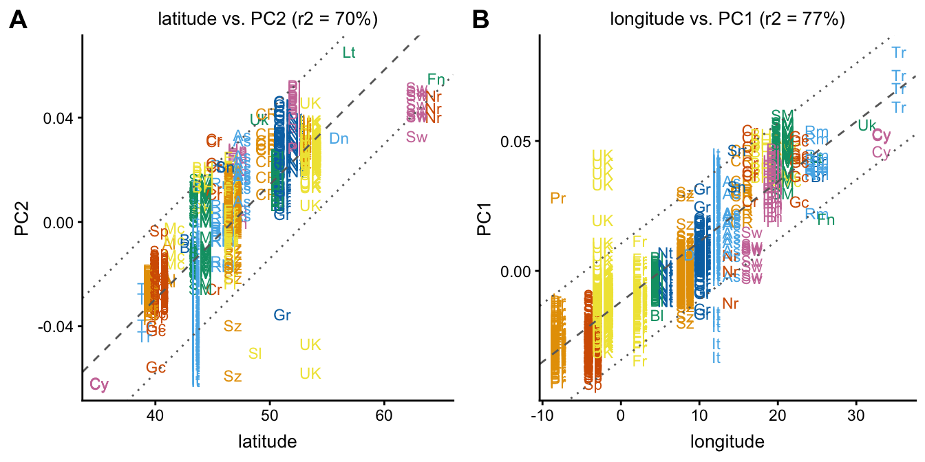
This is a more condensed version of the previous plot obtained by setting group = "country.abbrv" and label = NULL.
plot1 <- plot(popres,coords = c("latitude","PC2"),group = "country.abbrv",
              label = NULL,show.legend = FALSE)
plot2 <- plot(popres,coords = c("longitude","PC1"),group = "country.abbrv",
              label = NULL,show.legend = FALSE)
plot_grid(plot1,plot2,labels = c("A","B"))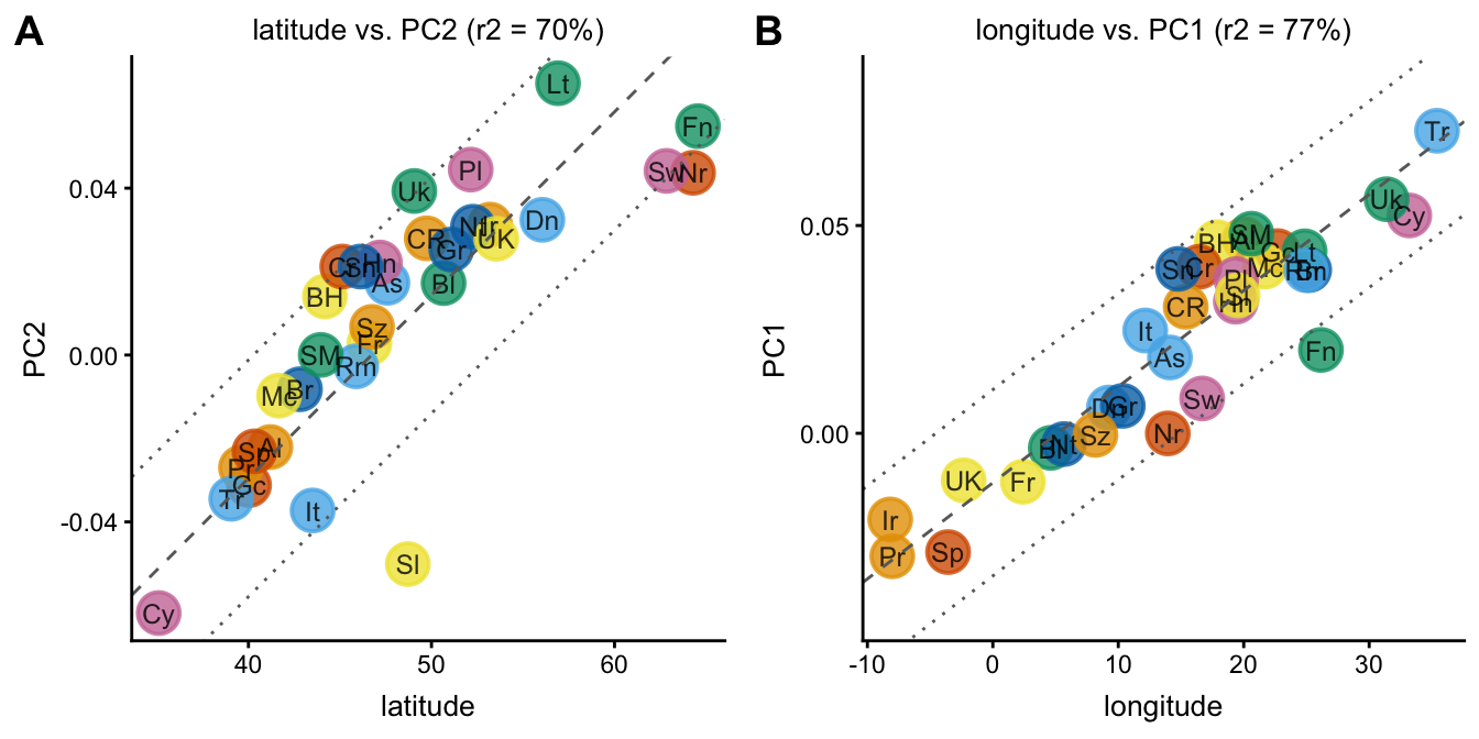
Next, we set the “color” argument to visualize the East-West and North-South trends in PC space.
plot1 <- plot(popres,color = "latitude",group = "country.abbrv")
# Variance explained will be added to the axis labels.
plot2 <- plot(popres,color = "longitude",group = "country.abbrv")
# Variance explained will be added to the axis labels.
plot_grid(plot1,plot2,labels = c("A","B"))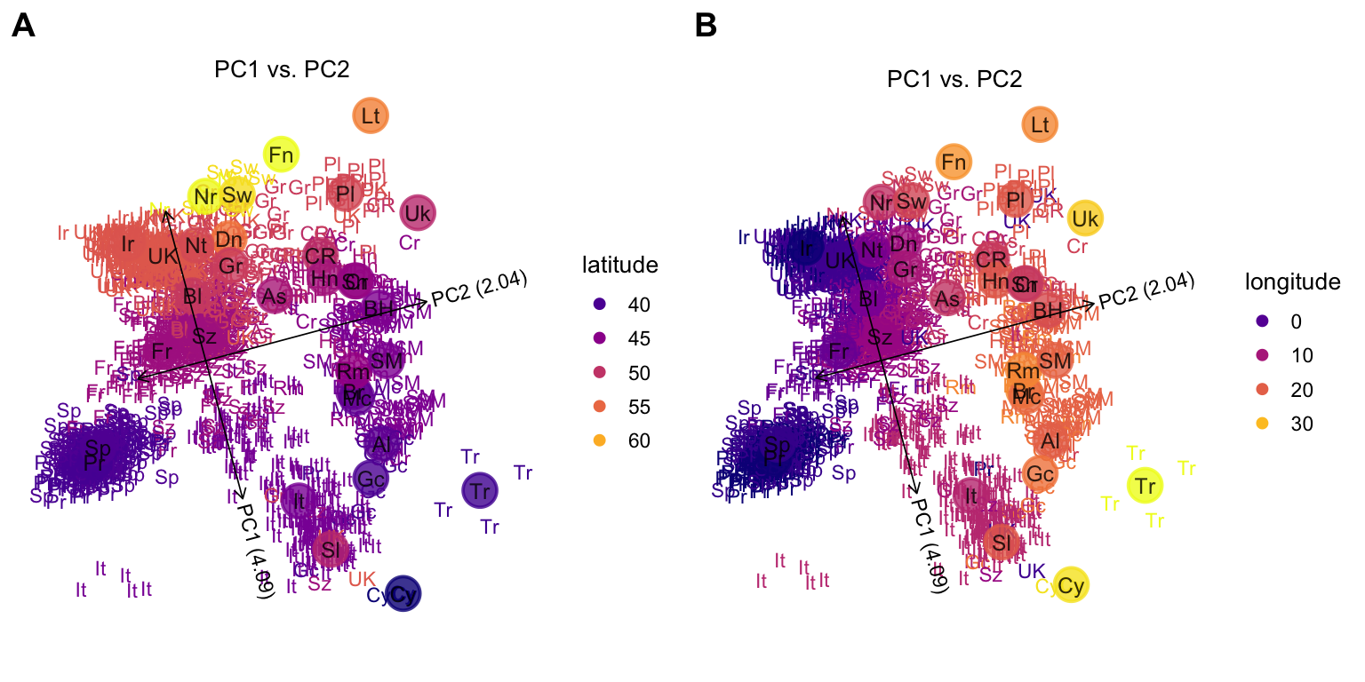
Here is alternative way to visualize the same result on a map of Europe; the colors are used to depict PCs 1 and 2.
plot1 <- plot(popres,coords = c("longitude","latitude"),color = "PC1",
              group = "country.abbrv",overlay = overlay_map_europe)
plot2 <- plot(popres,coords = c("longitude","latitude"),color = "PC2",
              group = "country.abbrv",overlay = overlay_map_europe)
plot_grid(plot1,plot2,labels = c("A","B"))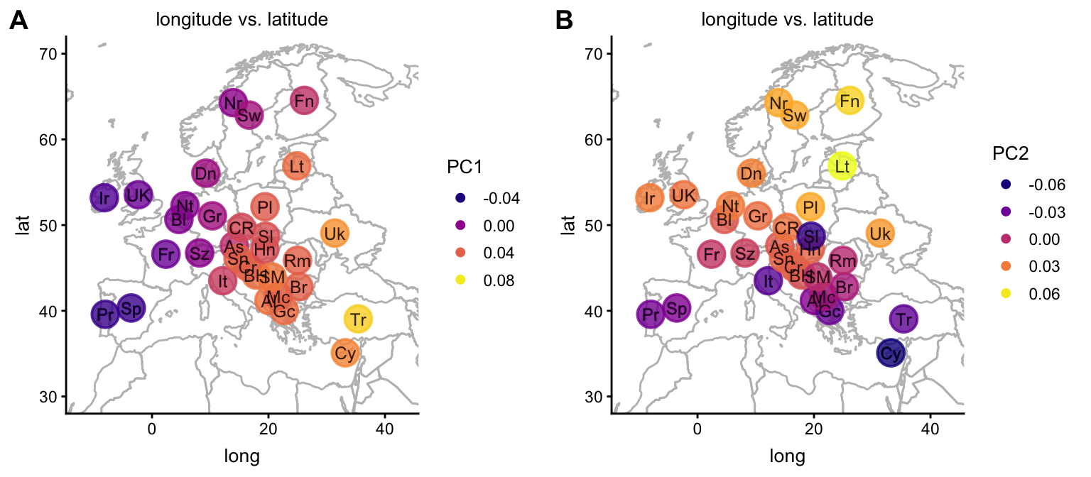
In view of the strong relationship between geography within Europe and the first two PCs computed from the genotype data, we attempt to fit the samples onto a map of Europe by translating and scaling PCs 1 and 2.
fit1 <- lm(longitude ~ PC1,popres$data)
fit2 <- lm(latitude ~ PC2,popres$data)
mu1  <- coef(fit1)[["(Intercept)"]]
mu2  <- coef(fit2)[["(Intercept)"]]
b1   <- coef(fit1)[["PC1"]]
b2   <- coef(fit2)[["PC2"]]
popres.for.map <-
  pcaviz_scale(popres, scale = c(b1,b1),dims = c("PC1","PC2")) %>%
  pcaviz_translate(a = c(mu1,mu2),dims = c("PC1","PC2"))
Plot PCs 1 and 2 onto the map of Europe after this scaling and translation step.
plot(popres.for.map,label = NULL,group = "country",
     show.legend = FALSE,overlay = overlay_map_europe)
# Variance explained will be added to the axis labels.
Next, plot all the samples onto the map of Europe.
plot(popres.for.map,group = NULL,overlay = overlay_map_europe)
# Variance explained will be added to the axis labels.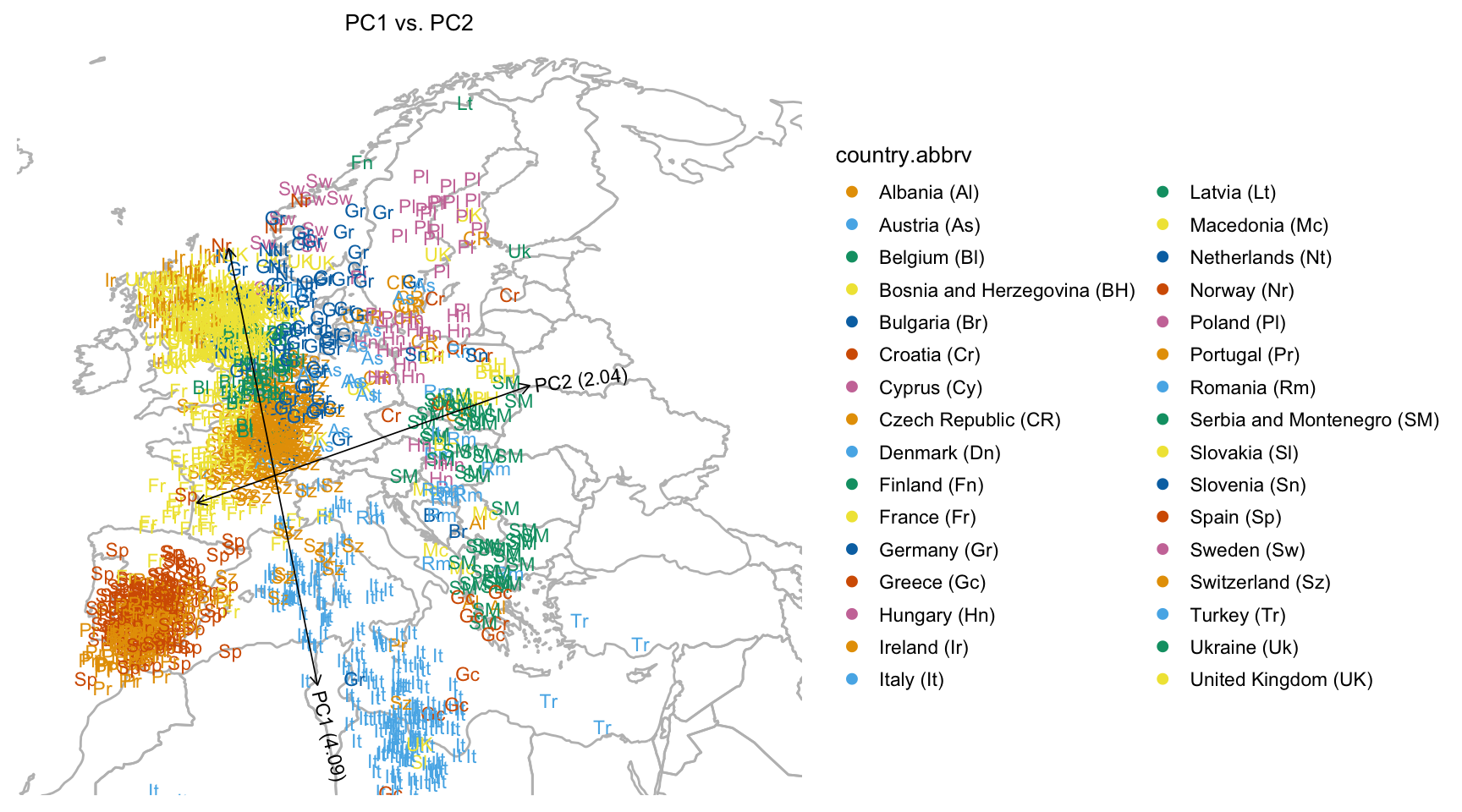
We can also easily create interactive version of this plot, and embed it in a separate HTML file. View the interactive plot here.
popres_plotly <-
  plot(popres.for.map,plotly = TRUE,overlay = overlay_map_europe,
       tooltip = c("id","country","longitude","latitude","PC1","PC2"),
       plotly.file = "popres_plotly.html")
# Variance explained will be added to the axis labels.
Note that the interactive plot can also be easily embedded within this document. In this example we have placed it in a separate webpage because loading the JavaScript can be slow in some browsers.
Finally, we compare PCs 1 and 2 against country-of-origin using the “pcaviz_violin” interface. Since density estimates are less useful for small numbers of samples, here we show only countries with a sample size of at least 10.
countries <- c("AT","BE","CH","CZ","DE","ES","FR","GB","HU","IE","IT",
               "NL","PL","PT","RO","RS","SE")
dat <- subset(popres,is.element(abbrv,countries))
pcaviz_violin(dat,pc.dims = c("PC1","PC2"),
              plot.grid.params = list(nrow = 2))