This vignette illustrates the PCAviz plotting interface on the Iris data set. Although this data set is small and near ubiquitously used for simple demonstrations in R, it serves well to illustrate the range of plotting options in the PCAviz package.
Begin by loading these packages into your R environment.
library(PCAviz)
library(ggplot2)
library(magrittr)
# library(rsvd)
Load the data and compute the PCs
Load the Iris data. Here, we add an “id” column to the table.
data(iris)
iris <- cbind(iris,data.frame(id = 1:150))
iris <- transform(iris,id = as.character(id))
Compute principal components using prcomp (alternatively, you may use princomp or rpca from the rsvd package).
# out.pca <- princomp(iris[1:4])
# out.pca <- rpca(iris[1:4],k = 4,center = TRUE,scale = FALSE,retx = TRUE)
out.pca <- prcomp(iris[1:4])
Create the “pcaviz” object from the Iris data and the computed PCs.
iris <- pcaviz(out.pca,dat = iris)The first PC captures over 90% of the total variance in the Iris samples.
screeplot(iris,type = "pve")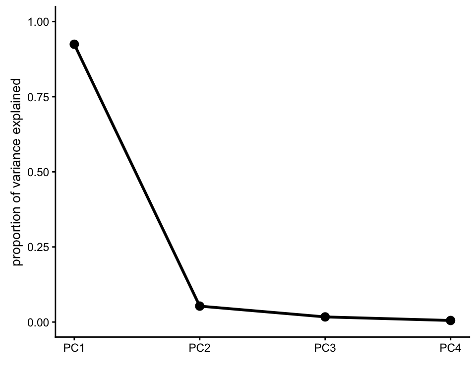
The first PC captures more variation in Petal Length than other variables.
pcaviz_loadingsplot(iris,pc.dim = "PC1")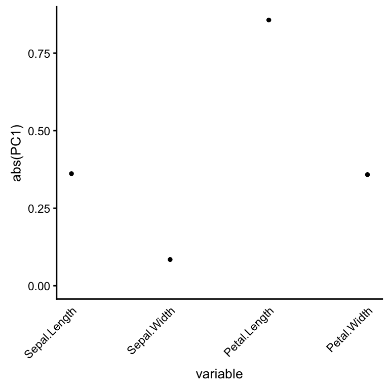
Scale the PCs, then rotate the first two PCs by 15 degrees.
iris <- pcaviz_reduce_whitespace(iris) %>%
        pcaviz_rotate(15)
Print out a summary of the PCA results and accompanying Iris data.
summary(iris)
# transformed principal components (PCs):
# # statistics are (s.d.,min,median,max)
# # s.d.=sqrt(eigenvalue)
#  variable n   stats
#  PC1      150 (2.056,-3.47,+0.315,+4.18)
#  PC2      150 (0.4926,-4.05,+0.0133,+3.2)
#  PC3      150 (0.2797,-3.67,-0.0791,+3.35)
#  PC4      150 (0.1544,-3.51,+0.00505,+3.51)
# categorical variables:
#  variable n   stats
#  Species  150 3 levels, largest=setosa (50)
# continuous variables:
# # statistics are (min,median,max)
#  variable     n   stats
#  Sepal.Length 150 (4.3,5.8,7.9)
#  Sepal.Width  150 (2,3,4.4)
#  Petal.Length 150 (1,4.35,6.9)
#  Petal.Width  150 (0.1,1.3,2.5)
# other variables:
#  variable n   stats
#  id       150 <NA>
Create visualizations of the Iris PCA results
Calling plot without any additional options shows the samples projected onto the first two PCs, labeled by Species. The large circles represent the group summaries (that is, the median PC projection for each of the three Iris species). Also observe that an abbreviated label is automatically created.
plot(iris)
# Proportion of variance explained (PVE) will be added to the axis labels.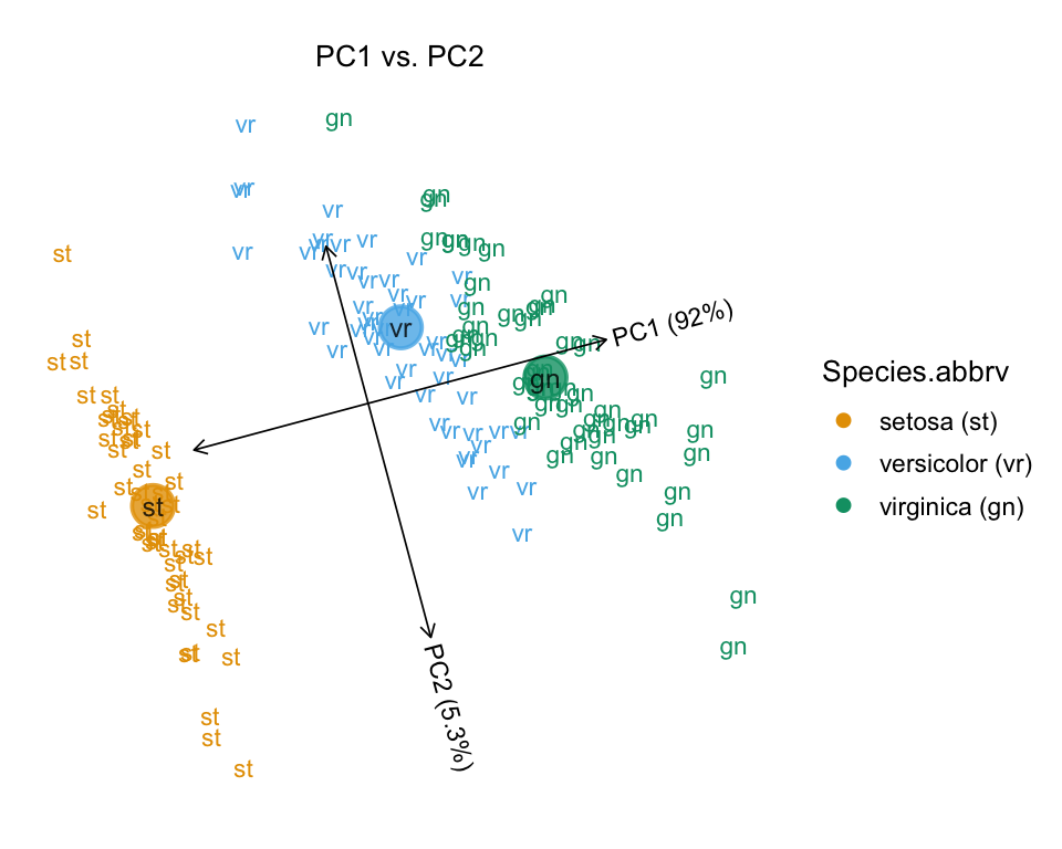
# Abbreviations used in plot:
#  Species    Species.abbrv
#  setosa     st
#  versicolor vr
#  virginica  gn
Setting draw.points = TRUE instead uses different colors and shapes to depict the “Species” assignment.
plot(iris,draw.points = TRUE)
# Proportion of variance explained (PVE) will be added to the axis labels.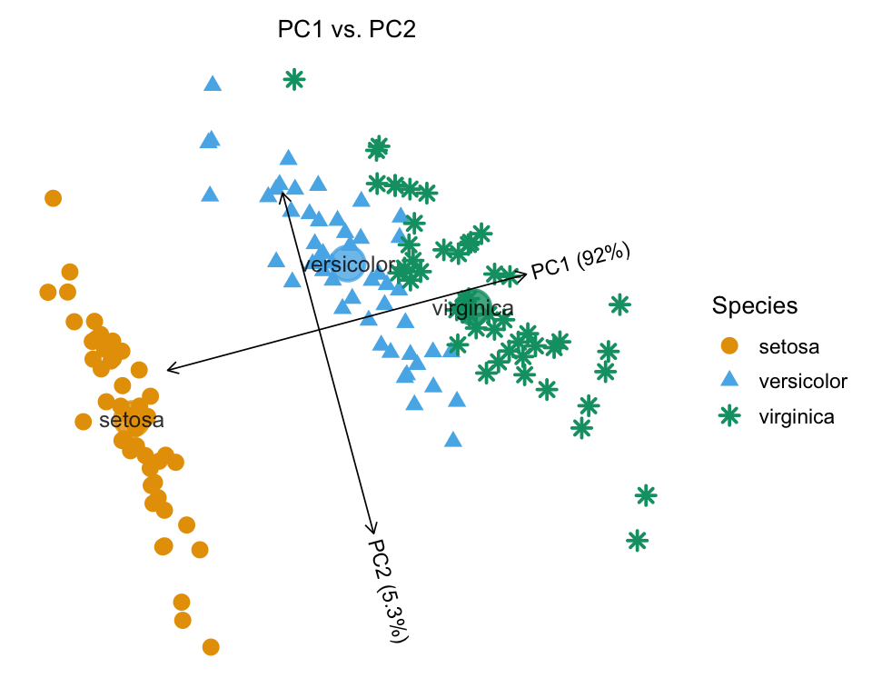
In the next plot, we use a color gradient to represent a continuous variable (Petal Length), and the sample ids are plotted instead of points.
plot(iris,color = "Petal.Length",label = "id")
# Proportion of variance explained (PVE) will be added to the axis labels.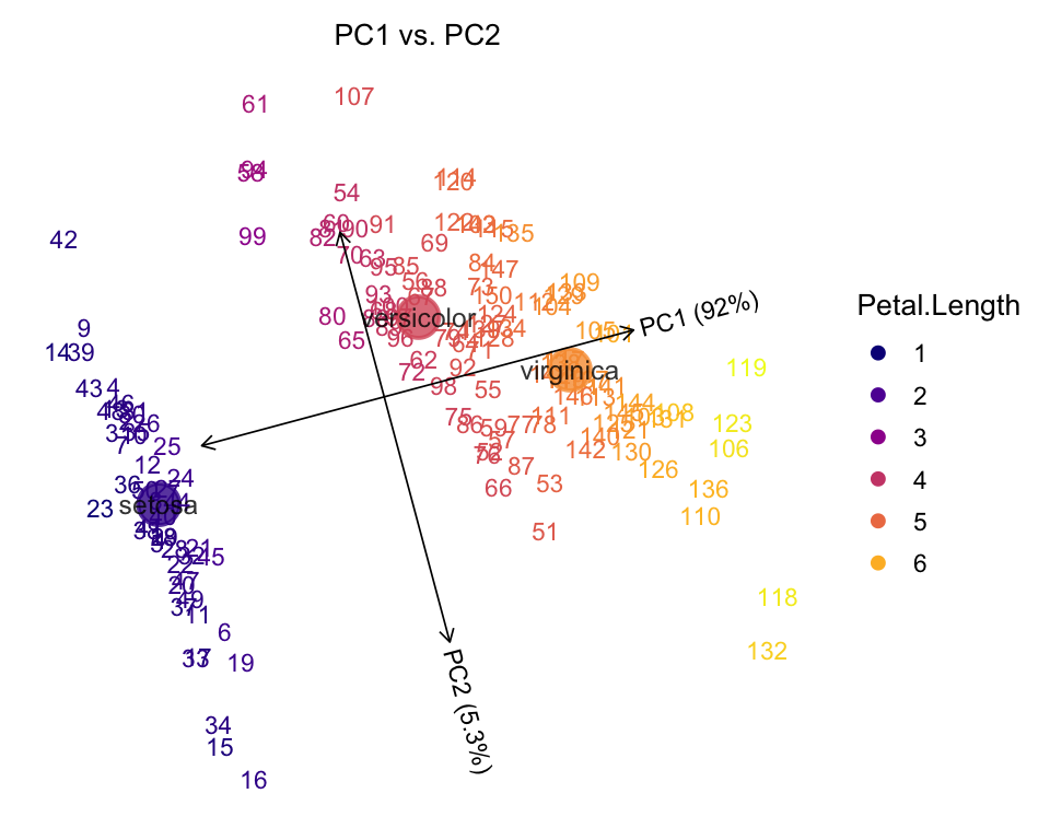
Show Petal Length as different colors, and Species as different shapes.
plot(iris,draw.points = TRUE,color = "Petal.Length",shape = "Species")
# Proportion of variance explained (PVE) will be added to the axis labels.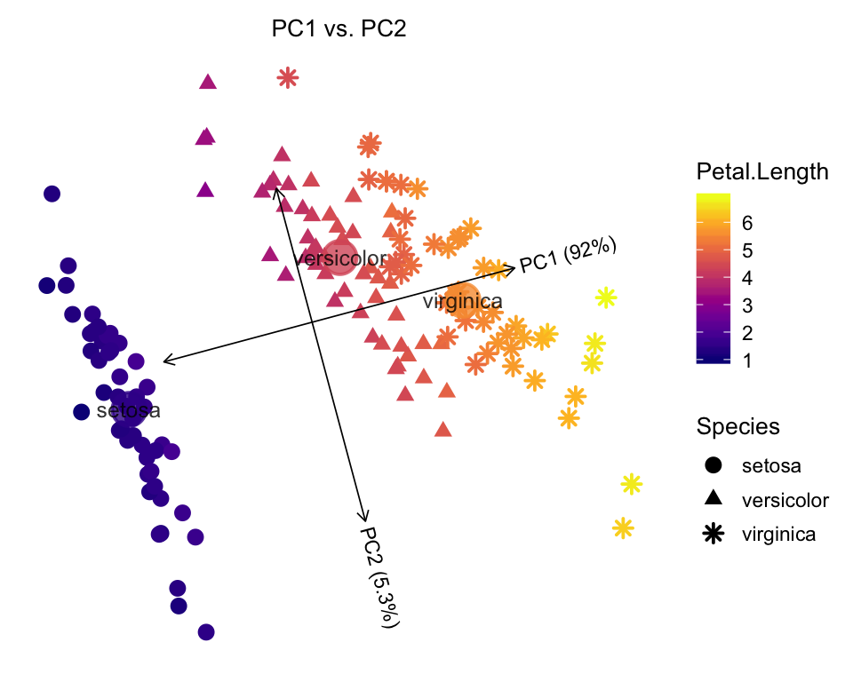
Plot the first PC against Petal Width. When plotting a PC against a data column, the linear relationship between the two variables is automatically summarized with the linear best fit (dashed line), and the confidence intervals (dotted lines).
plot(iris,coords = c("PC1","Petal.Width"),draw.points = TRUE)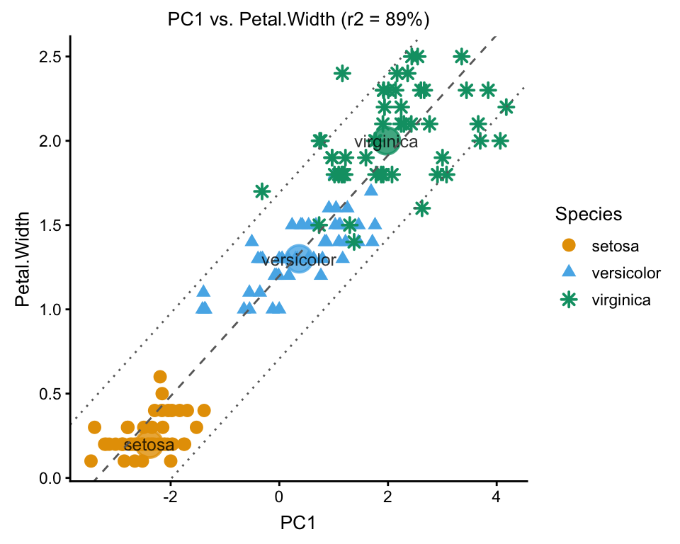
The PCAviz plotting interface also allows for quickly plotting multiple combinations of PCs. The default, when multiple PCs are selected, is to plot all combinations of the PCs:
plot(iris,coords = paste0("PC",1:4),group = NULL)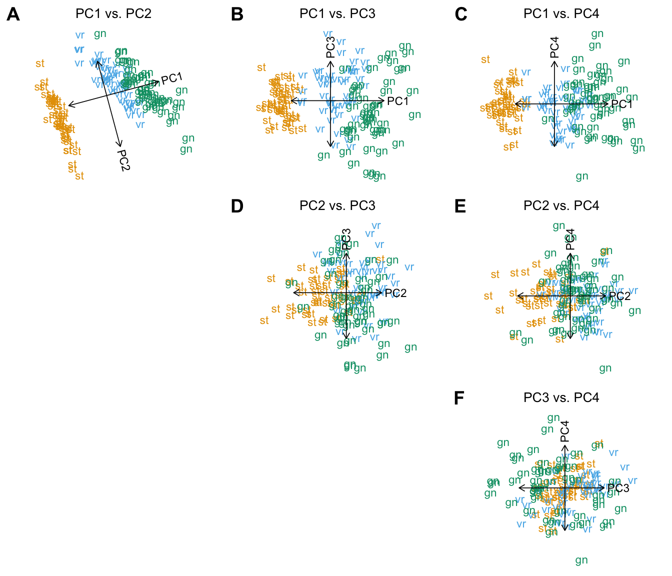
# Abbreviations used in plot:
#  Species    Species.abbrv
#  setosa     st
#  versicolor vr
#  virginica  gn
An alternative to plotting all PC combinations is to plot pairs of consecutive PCs, which can be conveniently performed by setting arrange.coords = "consecutive.pairs":
plot(iris,coords = paste0("PC",1:4),arrange.coords = "consecutive.pairs",
     draw.points = TRUE,group = NULL)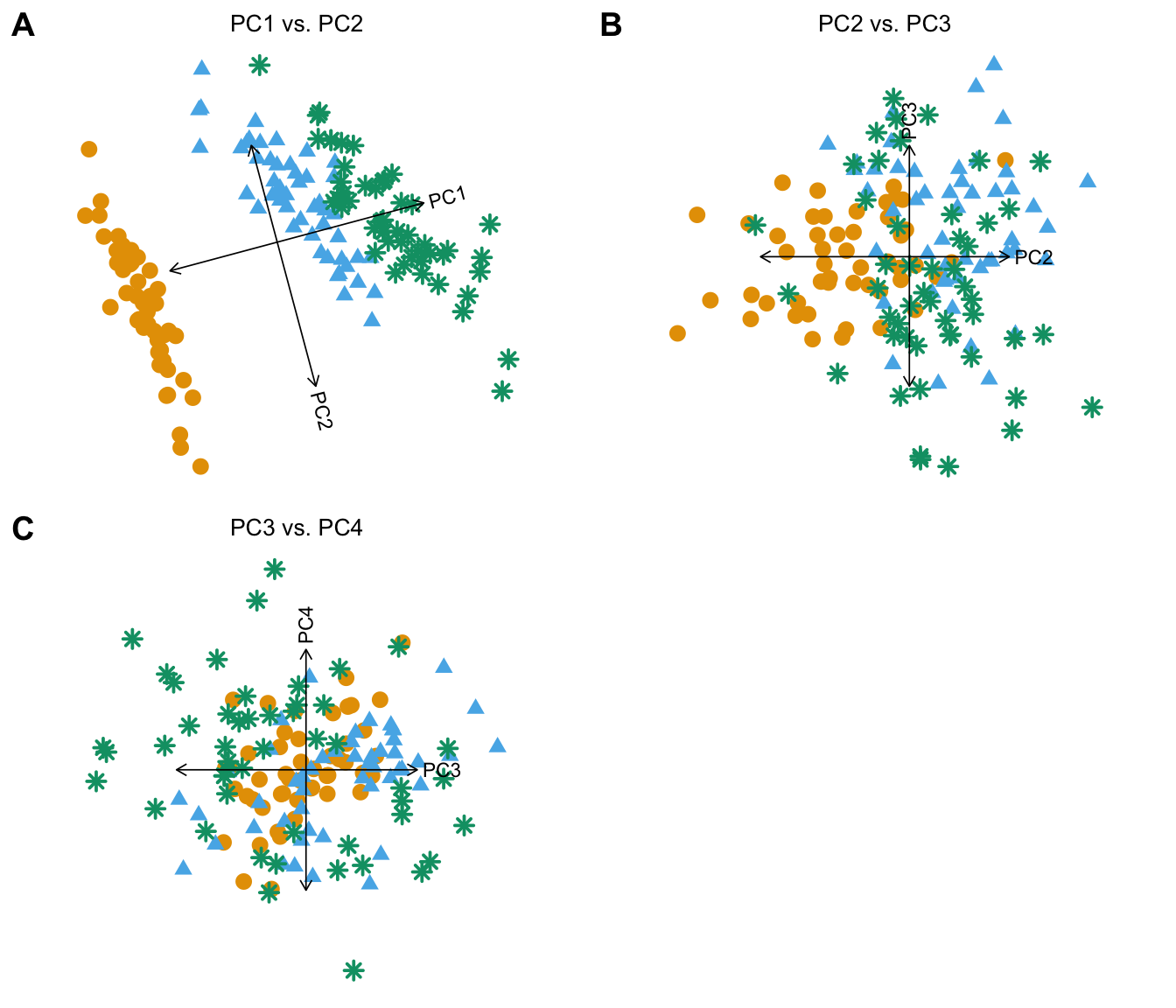
The PCAviz package has an easy-to-use interface for creating violin plots to visualize the relationship between PCs and categorical data variables. In this example, Species is compared against all four PCs.
pcaviz_violin(iris)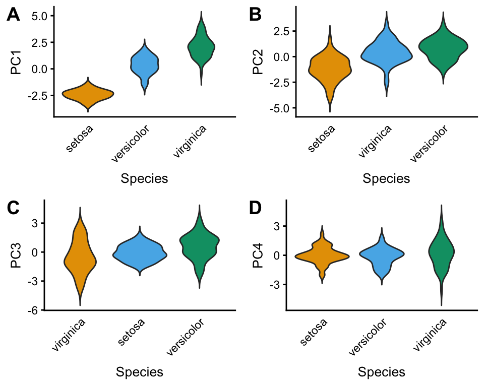
One advantage of ggplot2 graphics is that it easily allows for combining plots; however, one has to take some care to ensure that the ggplot layers are evaluated correctly. Here we give an example of overlaying additional data on top of the PCAviz scatterplot (we use this additional layer in this example to highlight samples with unusually small or unusually large sepals). Note that the inherit.aes = FALSE option is needed, otherwise the code will generate an error.
dat <- subset(iris$data,Sepal.Width <= 2 | Sepal.Width >= 4)
dat <- with(dat,data.frame(x = PC1,y = PC2))
plot(iris,draw.points = TRUE,shape = "Species",group = NULL) +
  geom_point(data = dat,aes(x = x,y = y),
             shape = 1,size = 5.5,inherit.aes = FALSE)
# Proportion of variance explained (PVE) will be added to the axis labels.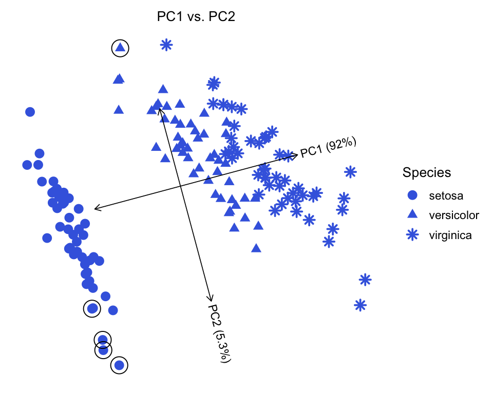
Create an interactive plot using the plotly package, and embed it in a separate HTML file. View the interactive plot here.
iris_plotly <- plot(iris,plotly = TRUE,
                    tooltip = c("id","Species","Sepal.Length","Sepal.Width",
                                "Petal.Length","Petal.Width"),
                    plotly.file = "iris_plotly.html")
# Proportion of variance explained (PVE) will be added to the axis labels.
Note that the interactive plot can also be easily embedded within this document. In this example we have placed it in a separate webpage because loading the JavaScript can be slow in some browsers.