This vignette illustrates PCAviz for visualizing principal components in the Regmap data set. The first two PCs of the genotype data distinguish geographic origins of the Arabidopsis thaliana samples, although some overlap is evident.
Begin by loading these packages into your R environment.
library(PCAviz)
library(cowplot)
# Warning: package 'cowplot' was built under R version 3.4.4
Load the data and PCA results
Load the RegMap data and the computed PCs, and convert these data to a “pcaviz” object. (We do not include the “region” column.)
data(regmap)
regmap <- pcaviz(dat = regmap[-10])
Print a summary of the RegMap data.
summary(regmap)
# first 4 (of 10) principal components (PCs):
# # statistics are (s.d.,min,median,max)
# # s.d.=sqrt(eigenvalue)
#  variable n    stats
#  PC1      1307 (NA,-64.7,+0.307,+104)
#  PC2      1307 (NA,-53.8,-2.38,+112)
#  PC3      1307 (NA,-128,+3.44,+55.8)
#  PC4      1307 (NA,-70.3,-1.4,+74.3)
# categorical variables:
#  variable n    stats
#  country  1307 33 levels, largest=SWE (319)
# continuous variables:
# # statistics are (min,median,max)
#  variable         n    stats
#  median_intensity 1179 (127,526,1.47e+03)
#  latitude         1302 (-37.8,49.5,65.2)
#  longitude        1302 (-123,6.19,175)
# first 4 (of 6) other variables:
#  variable   n    stats
#  array_id   1307 <NA>
#  ecotype_id 1307 <NA>
#  nativename 1307 <NA>
#  firstname  1307 <NA>
Create visualizations of the RegMap PCA results
Calling “plot” without specifying any additional options shows the projection of the samples onto the first two PCs, with the samples labeled by the country in which they were found.
plot(regmap)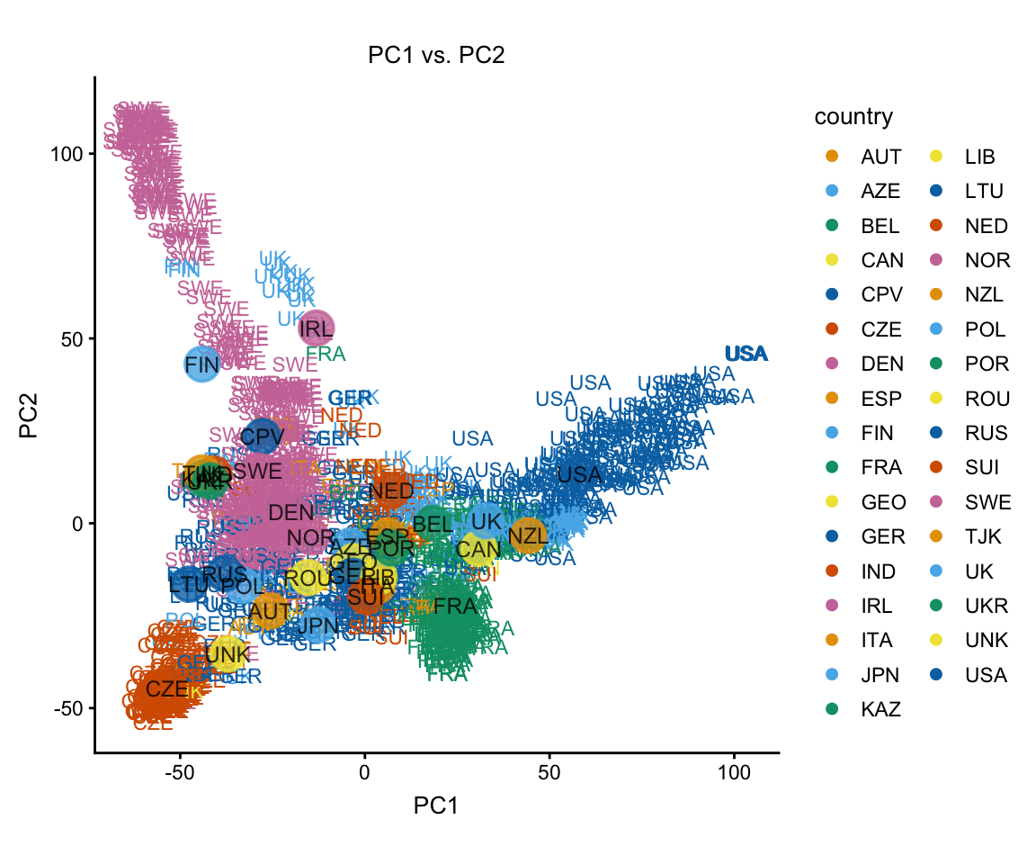
The group summaries add a lot of clutter to these plots, so we remove them. We also don’t need the legend.
plot(regmap,group = NULL,show.legend = FALSE)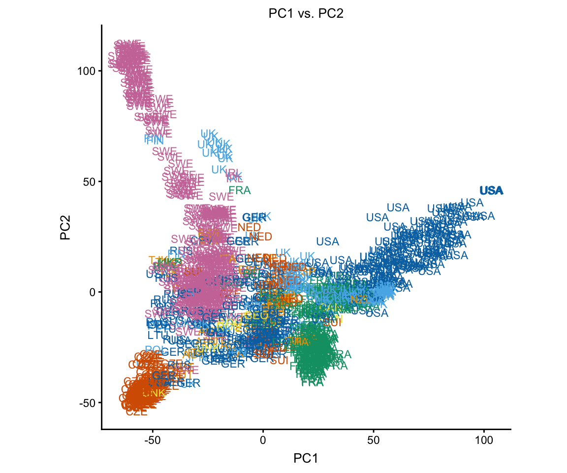
Next, show the country assignments using different colors and shapes instead of labels.
plot(regmap,draw.points = TRUE,group = NULL)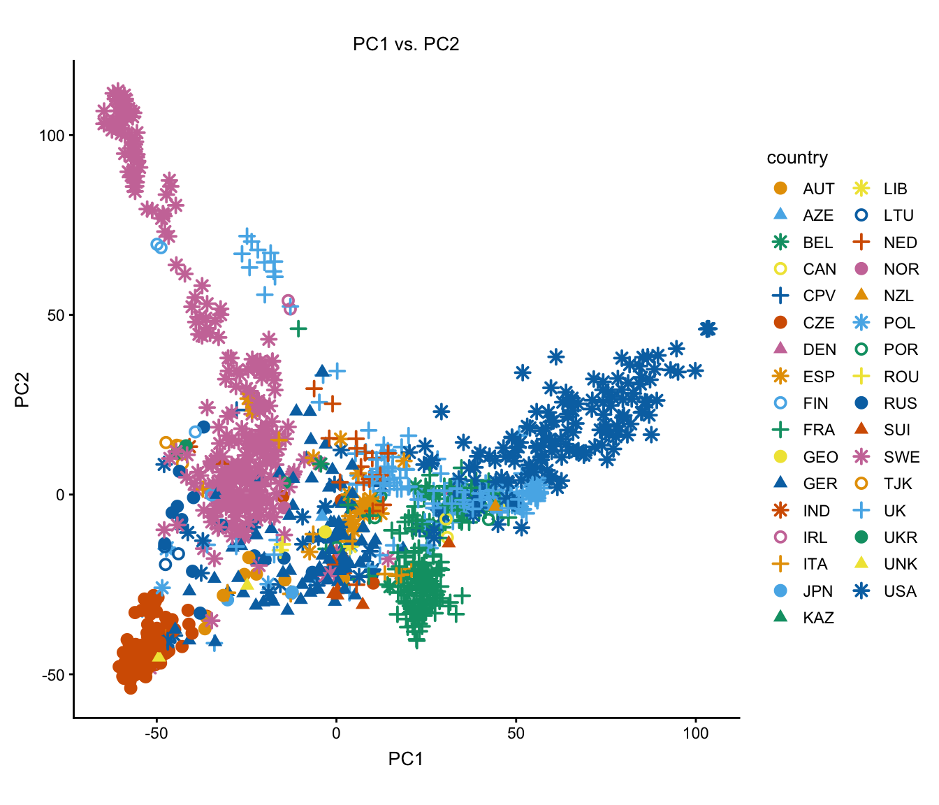
By setting the color argument to “longitude” and “latitude”, these next two plots help us understand the relationship between geography and projection onto the PC embedding.
plot1 <- plot(regmap,draw.points = TRUE,color = "longitude",group = NULL)
plot2 <- plot(regmap,draw.points = TRUE,color = "latitude",group = NULL)
plot_grid(plot1,plot2,labels = c("A","B"))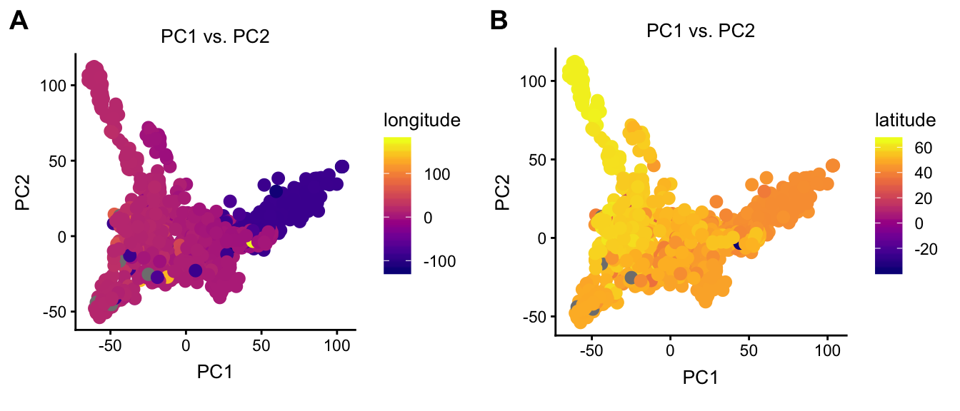
Does “median intensity” (this is a technical artifact) explain some variation in the first PC?
plot(regmap,coords = c("PC1","median_intensity"),draw.points = TRUE,
     group = NULL)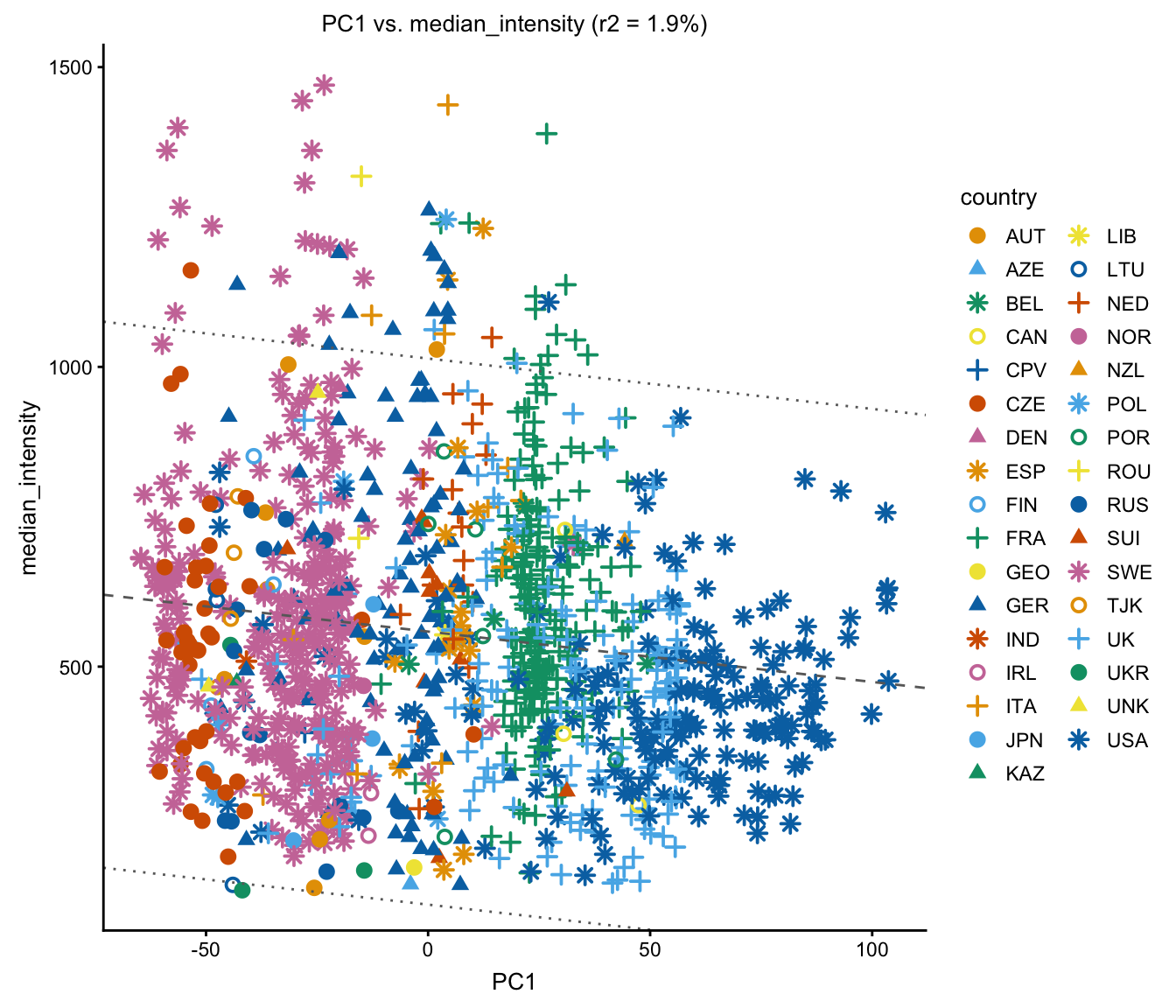
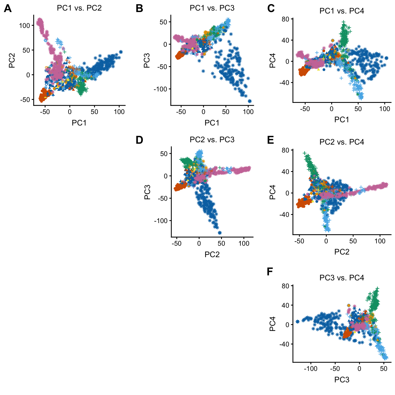
The plot function can also be used to quickly plot combinations of PCs. This code also illustrates customization of the plotting parameters—in this case, since the plots are small, the default point size is a bit too large.
plot(regmap,coords = paste0("PC",1:4),group = NULL,draw.points = TRUE,
     geom.point.params = list(size = 1,na.rm = TRUE))